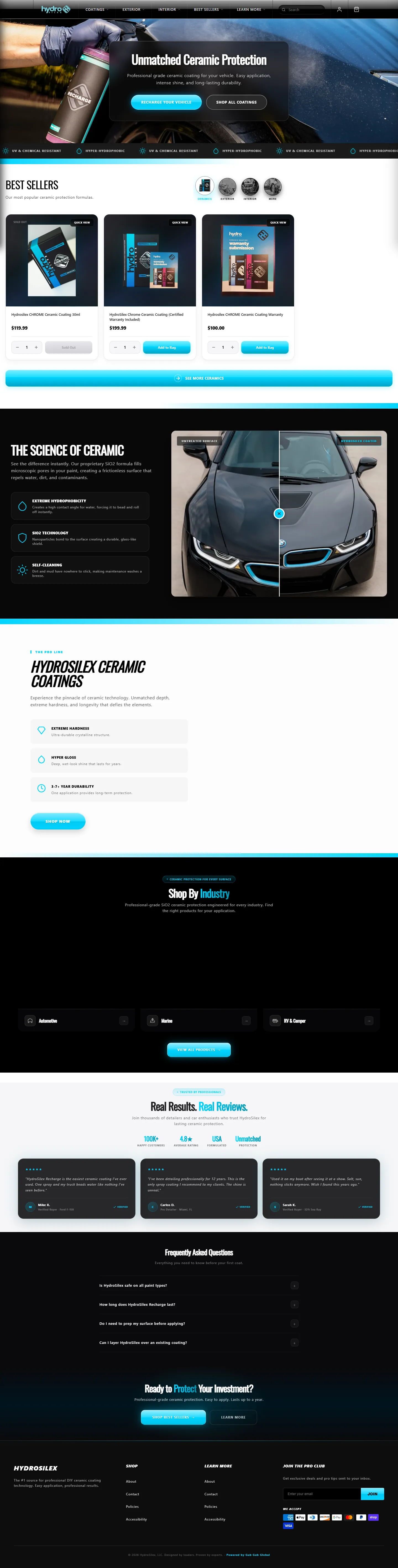
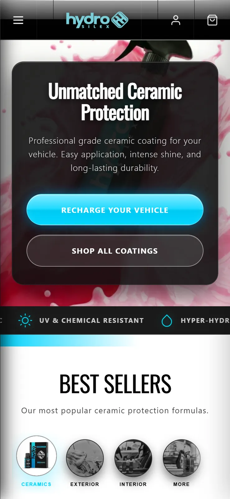
Black, plus one electric color.
The palette is near-black and a single signal cyan. Cyan is reserved for the things that matter: the active category, the glow on the primary button, the rule under a section. When it's rare, it reads as energy.
HydroSilex makes professional-grade SiO2 ceramic coatings. The category is loud, cluttered, and sold like car wash soap. I rebuilt the brand to look as engineered as the product: black, one electric color, glass, and a store that explains the chemistry before it asks for the sale.
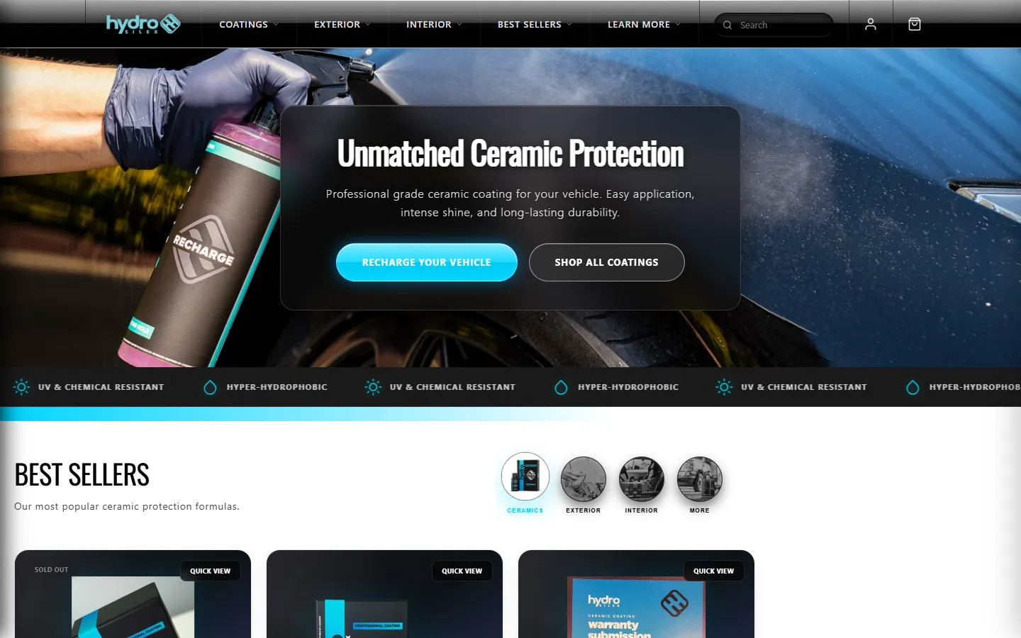
Ceramic coatings are bought by people who want proof. Professionals, boat owners, RV owners, enthusiasts. They compare contact angles and durability claims. The brand had to earn that trust visually before a single spec was read.
So the direction was simple to say and strict to hold: clinical, dark, precise. Nothing cartoonish, no splash graphics, no rainbow gradients. One color that means "coating," and everything else gets out of its way.
The palette is near-black and a single signal cyan. Cyan is reserved for the things that matter: the active category, the glow on the primary button, the rule under a section. When it's rare, it reads as energy.
Headlines are tall, condensed capitals that read like equipment labeling. Body copy is a calm, round sans so the technical claims stay easy to read.
The coating's promise is "a durable, glass-like shield." So the interface is dark frosted glass with a rim light on top. The material does the selling quietly.
Visitors pick their world first: Automotive, Marine, RV & Camper. A boat owner never wades through car products to find theirs, and every industry page speaks its own language.
A "Science of Ceramic" layer explains hydrophobicity, SiO2 bonding, and self-cleaning in plain words. Informed buyers buy the pro product. Confused ones buy the cheap one.
The primary call to action is "Recharge your vehicle," tying the button to the product line instead of a generic "Shop now."
A high contact angle forces water to bead and roll off instantly.
Nanoparticles bond to the surface, creating a durable, glass-like shield.
Dirt and mud have nowhere to stick, so maintenance washes get easy.
#050608Every surface#14181ECards, glass base#2FD6FFAction + emphasis only#EEF8FCTextWant the short version? .